How to use color effectively in your scientific visualizations
Making a good figure is an art, requiring careful consideration of the data and the reader. Color is one tool that can help communicate information, and should be a consideration whenever preparing to present data. Many readers will look at figures before (or instead of!) reading a paper. During talks, it is easy to miss context from the speaker. For this reason, the easier a figure is to understand by itself, the easier it will be for your audience. There are numerous factors to consider when choosing a palette, but the right choices can make it easier to understand the underlying data.
Principles of good color selection
- Colors should be easy to distinguish from one another. Choosing colors that contrast well against each other and the background makes a figure easier to read.
- When possible, color selection should be accessible for those with color vision deficiency. When that’s not possible, consider including labels, patterns, or other design elements to improve legibility.
- Colors should be chosen to highlight the message of the figure. Consider if color can be used to call attention to important data, or to add additional context that would be helpful to a viewer.
- Be consistent where possible. If you’re making multiple graphs and plots, use the same color palette across all of them.
- Consider aesthetics. While aesthetics should never interfere with presenting data, it’s fine to choose colors that complement each other.
Talking about colors
When we say “color,” what exactly do we mean? There are many ways to talk about color choices, but one of the easiest is to consider three elements that describe a color: hue, saturation, and brightness.
Hue
Hue is the “color” part of the color – whether we see something as “blue” or “orange” or “magenta.” Hue perception varies from person to person. Color vision deficiencies can make discrimination between different hues challenging or impossible, meaning that hue alone is not enough to distinguish two colors on a figure.
Saturation
Saturation is a description of how concentrated the hue is in the color. Less saturated colors are closer to gray, while more saturated colors are more vibrant. Increasing saturation can help distinguish two colors with different hues. However, perception of saturation is very dependent on surrounding colors, so most people will only be able to recognize large differences in saturation.
Brightness
Brightness, or value, is a measurement of how dark a color looks. Since most figures are on white backgrounds, colors that are too light may be difficult to distinguish. Very dark colors, even if they vary in hue and saturation, can be hard to tell apart, especially if they aren’t adjacent to each other, or appear in small amounts. Brightness is the most powerful tool for creating color difference.
Together, these factors can describe almost any color. Graphics programs and color picker tools almost all have modes that can alter hue, saturation and brightness (look for HSB or HSL modes).
Designing accessible, legible palettes
When designing figures and selecting colors, consider your potential audience first. Genetic color vision deficiencies (CVD) affect approximately one in twenty-four people. There are many ways CVD can affect color perception, and people with different conditions will have trouble with different hues. There are many online tools that try to mimic how different CVD affect different colors; test different palettes to see which colors are hard to distinguish.
One of the challenges of choosing colors is that color perception is situational. Context can strongly alter our ability to perceive colors. Smaller areas of colors, especially surrounded by white, as is common for figure backgrounds, can make it hard to tell colors apart. A set of colors that works well for a bar graph may need to be tweaked to work for a line graph. So in addition to testing colors for accessibility, it’s important to preview them in the actual figure (or at least a prototype of your figure) before making final selections. Tools like Viz can give you a preview of how colors look in different plot types, as well as preview how CVD might affect the plot.
If you do need to make adjustments, start with tweaking the brightness of colors, and then try adjusting hue and saturation.
Palettes for sequential, divergent, and qualitative data
Your data can affect palette choice. You can choose colors that emphasize relationships between the elements you’re plotting. This could be a variable from the sample itself, like the stimulation condition, or symbolize an outcome, like cytokine production. The kinds of data relationships can roughly be described as:
-
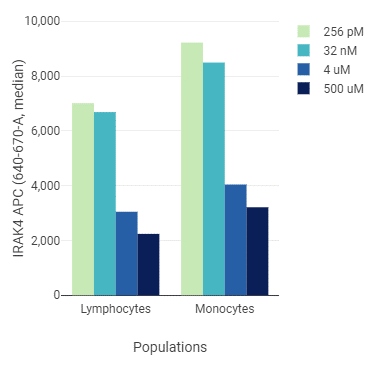
Sequential: the data can be categorized as “most” to “least” in terms of the variable you want to emphasize. For example, if your cells were stimulated with various concentrations of a cytokine, you could use a dark color for the highest concentration, and then increase the brightness for lower concentrations.
-
Divergent: the data can be categorized into two groups, usually mutually exclusive. For example, a cytotoxicity assay where conditions promoted either survival or cell death could use two colors, increasing in intensity with the effect size.
-
Qualitative: all data categories are equivalent to each other, or the data doesn’t have a relationship that you want to highlight. You might choose this option for showing the relative abundance of different unrelated populations in your data. In this case, you might choose colors that differ in hue, but have similar saturation or value.
In some cases, you’ll want to use a combination of the above strategies, or choose colors based on other factors.
Considering aesthetics
For most figures, there’s still a lot of possibilities for color selection, even after narrowing colors down to accessible options that fit the data. There are many different strategies to choosing colors that are attractive, but here are some common approaches used by artists and graphic designers.
Achromatic and monochromatic
The approach here is straightforward: choose a hue, and stick with it, altering the brightness along the way. This creates monochromatic or grayscale images (if you reduce saturation to zero). These are classic, and work well with nearly any color you start with.
Analogous
Another common approach is to use hues that are similar to each other. Choose a color on the color wheel, and then a shade or two on one side or the other, like blue and turquoise.
Complementary
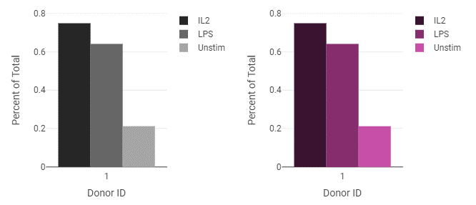
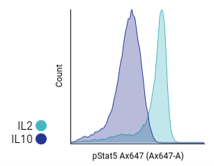
Complementary colors are hues that are opposite each other on the color wheel, like blue and orange. They can also serve well to highlight one piece of data – for example, a bright orange for a population of special interest among other populations using several shades of blue. A common variation of this is the use of grayscale for controls, and a more saturated color for other groups.
Complementary schemes are often challenging to use well in plots; red and green are a challenge for a large number of people with CVD, the yellow in purple-yellow pairings can be hard to see on white backgrounds, and if blue and orange are similar values, the image may not read well when printed. However, these color pairings can be useful for divergent data, and can produce attractive, accessible figures.
Combinations
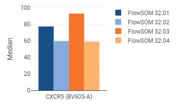
These can be especially useful when you require many colors; if you have 12 SOM clusters that you want to represent, then you may find that 12 shades of blue – or even 6 shades of blue and 6 shades of orange – are too difficult to distinguish. However, you might be able to use several monochromatic, analogous, or complementary palettes in tandem.
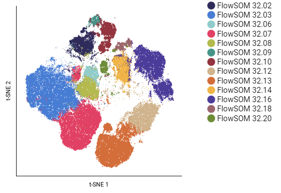
This example below draws from the “Indecision” palette, which uses several hues at various brightness and saturation levels to create a cohesive whole:
Color in CellEngine
CellEngine offers a variety of default palettes, including ones for sequential, divergent, and qualitative data. Color palettes can be customized to fit any color scheme you choose. Palettes can be copied and pasted between experiments, so when you find palettes you like, you can reuse them easily, or grab the colors to use in other graphics you’re making. For convenience, colors can be selected by the sort order of elements, or by assigning variables to specific colors from the palette. The more metadata you add to the annotations section of your experiments, the more options you have for coloring your figures to emphasize or reveal secondary information about your samples. If you’re making figures in CellEngine, check out our documentation for more details.
Additional resources
- ColorBrewer includes sequential, diverging, and qualitative palettes originally developed for cartography, and includes filters for accessible and printable options.
- Cubehelix is an approach initially developed to display images from astronomy, and creates palettes that perceptually go from dark to light, regardless of hue or saturation level.
- Accessible Palette is a tool to create palettes with consistent lightness and contrast.
- Viz Palette will show colors in different figures, and will display how colors could look for various color vision deficiencies.
- Points of view: Color blindness | Nature Methods has additional information on making colored graphs accessible.